Overview
In this project we redefine an institution from the ground up. Starting from the very core of what the brand truly stands for from strategy to then visual components we’d connect with a community with different touch points and visuals to create a new dynamic brand identity.
The Problem
The current BBG fails to not deliver a solid brand meaning with a vague goal. The brand Identity has not been updated in 10 years failing to highlight the beauty of the garden and what they stand for.
The Solution
The new BBG rebrand focuses on the Brooklyn Local community and the sanctuary that it offers to the public. It is a place where they can escape too, wind down but also learn about the amazing community and innovations that the BBG is fostering.
PROJECT
Brand Identity Design
TEAM
Genesis Lema, Maria Morocho, Joselyn Perez, Keishlyan Carrero
DURATION
4 months
TOOLS
Figma, After Effects, Illustrator
Dynamic Branding
BBG
The Brooklyn Botanic Garden provides a uniquely personal and tranquil environment, fostering a sense of peace within the community.
the core of BBG
Brand Profile
1
In this tab you can see whether a product has personal conflicts with your pre-imputed health concerns.
CORE VALUES
Connection with nature, Education, Environmental Conservation Stewardship
Positioning Statement
For its local community, the Brooklyn Botanic Garden is an urban garden that unites those to the world of plants, because they believe in inspiring a sense of appreciation and stewardship to the environment.
PERSONALITY
Mentorly, Peaceful, Community
logomark
structure analysis
Aa
TYPOGRAPHY: POPPINGS
Design system
Brand Identity
2
60%
The Sage
BRAND ARCHETYPE
#227DFF
Conservatory Blue
Seedling Green
#00D600
Brownstone Orange
#FF2700
#B90099
Oasis Purple
Brand Colors
ABCDEFGHIJKLMNOPQRSTUVWXYZ
abcdefghijklmnopqrstuvwxyz
30%
The Creator

Brooklyn Botanic Garden
03
Icons
Shop
Education
Events
Collections
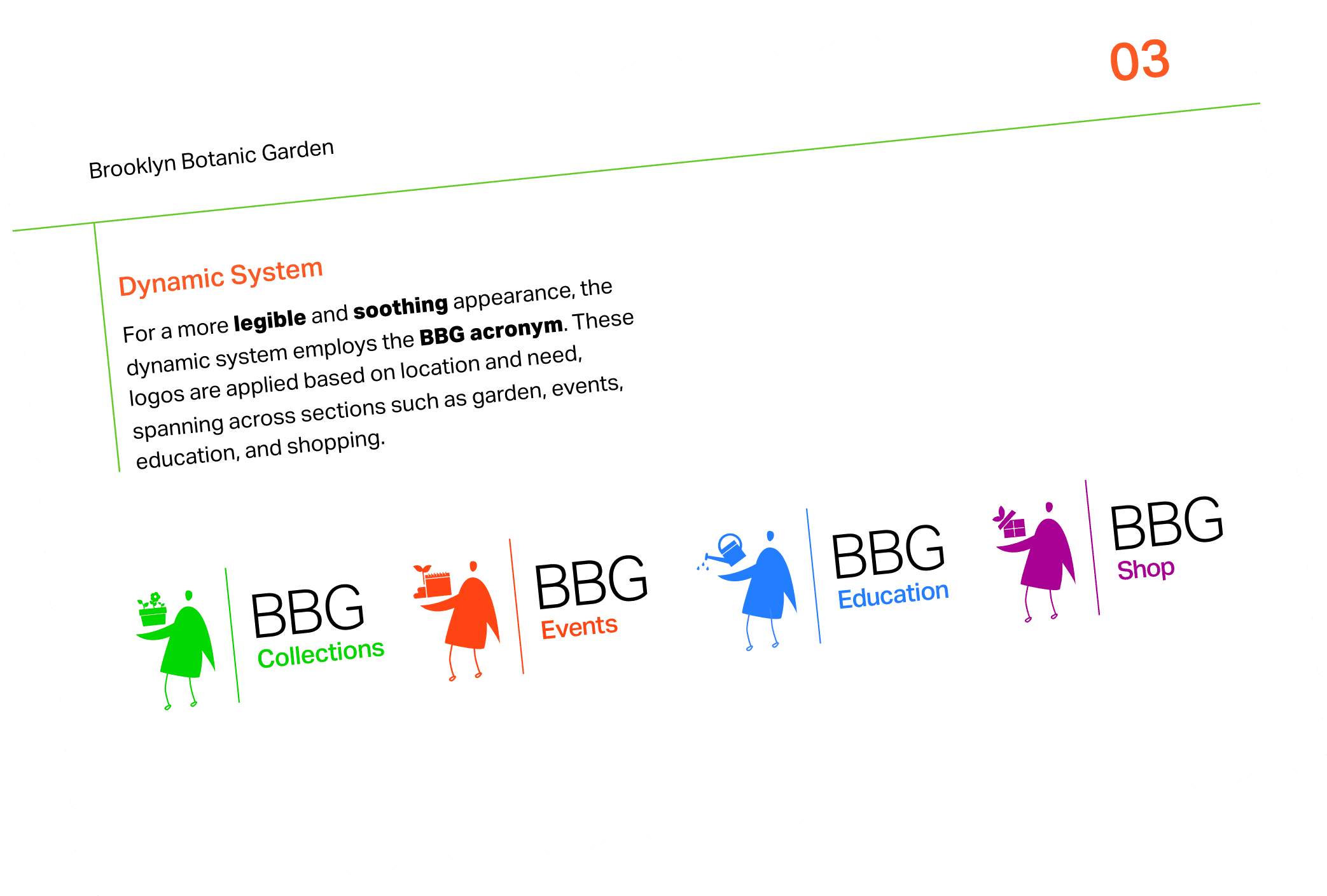
Each icon relates to a different part of the garden. Use icons according to the section they belong too. Do not change from their respective colors or black and white.
Brooklyn Botanic Garden
03
Vertical Logo Lockup
Utilize the vertical logo in square or tall compositions, and in scenarios where the primary logo would be excessively wide for the space.
Clearspace
Brooklyn Botanic Garden
03
Brand typeface
Aktiv Grotesk is a commanding yet neutral typeface, capable of complementing any message without overshadowing it. This versatile and varied typeface comprises a family of 24 styles, including matching italics, spanning from Hairline to Black.
ABCDEFGHIJKLMNOPQRSTUVWXYZ
Aa
abcdefghijklmnopqrstuvwxyz

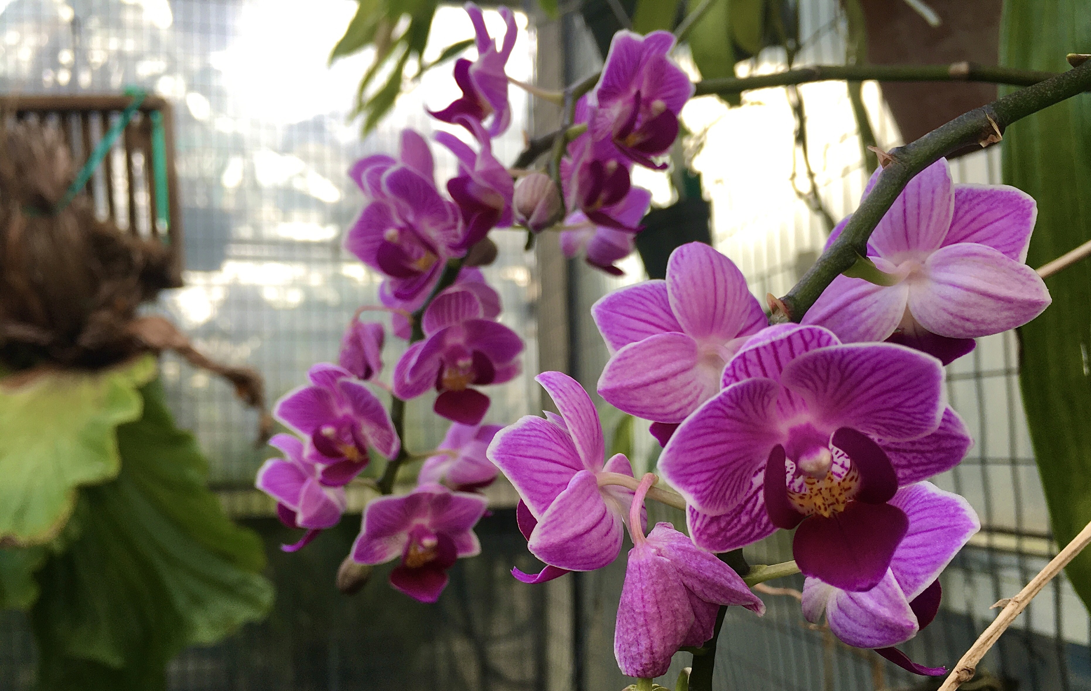

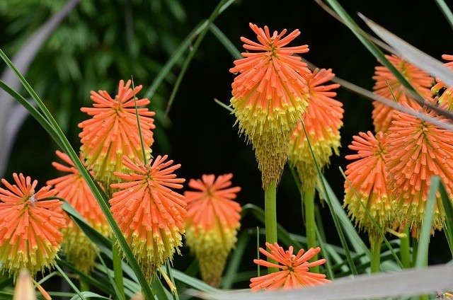
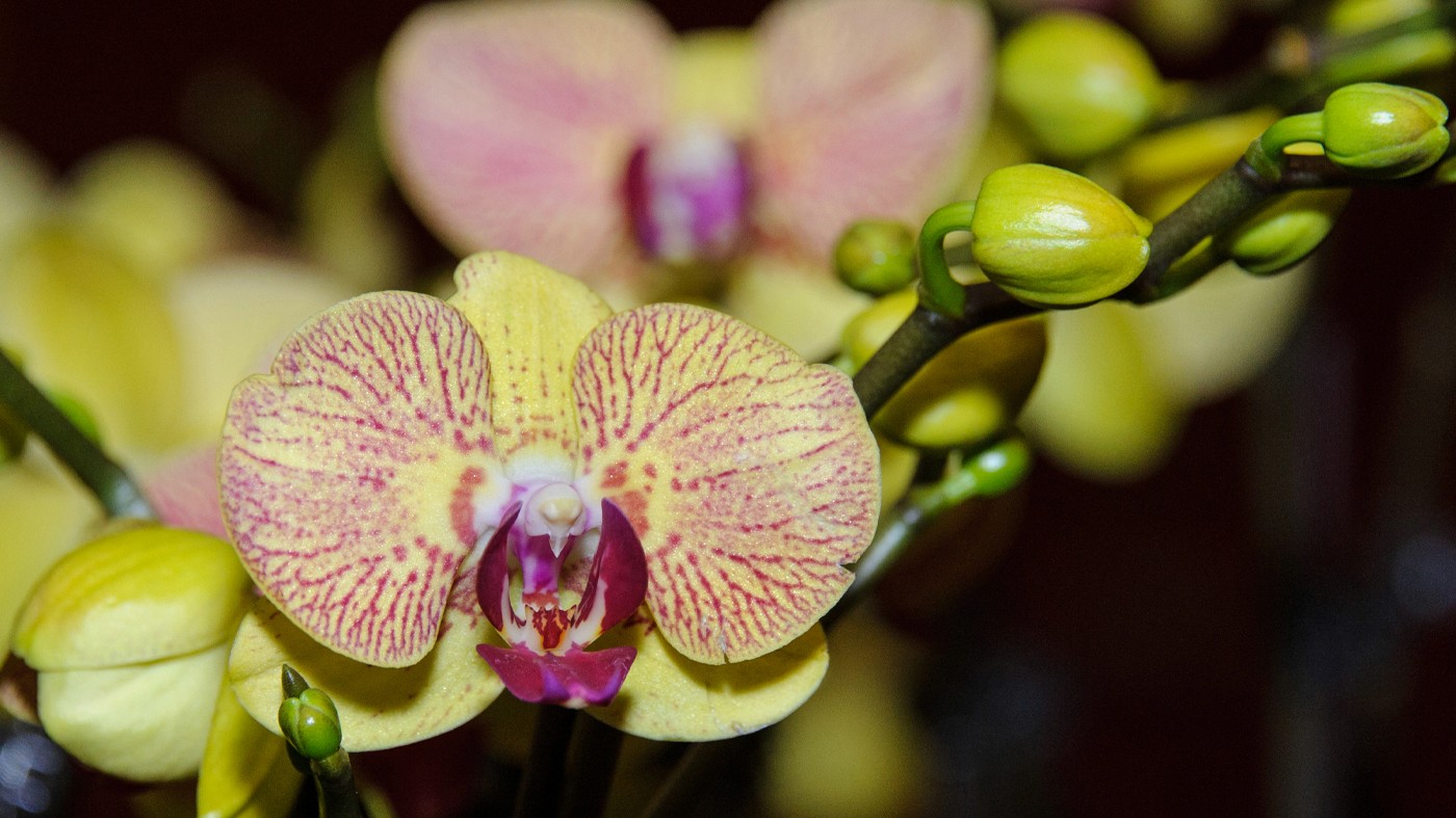
Brooklyn Botanic Garden
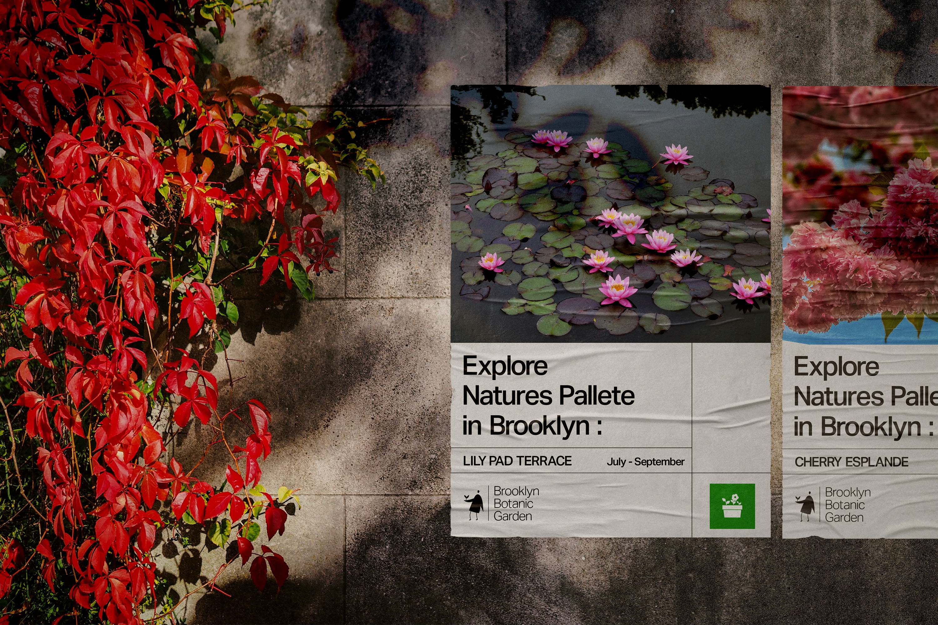
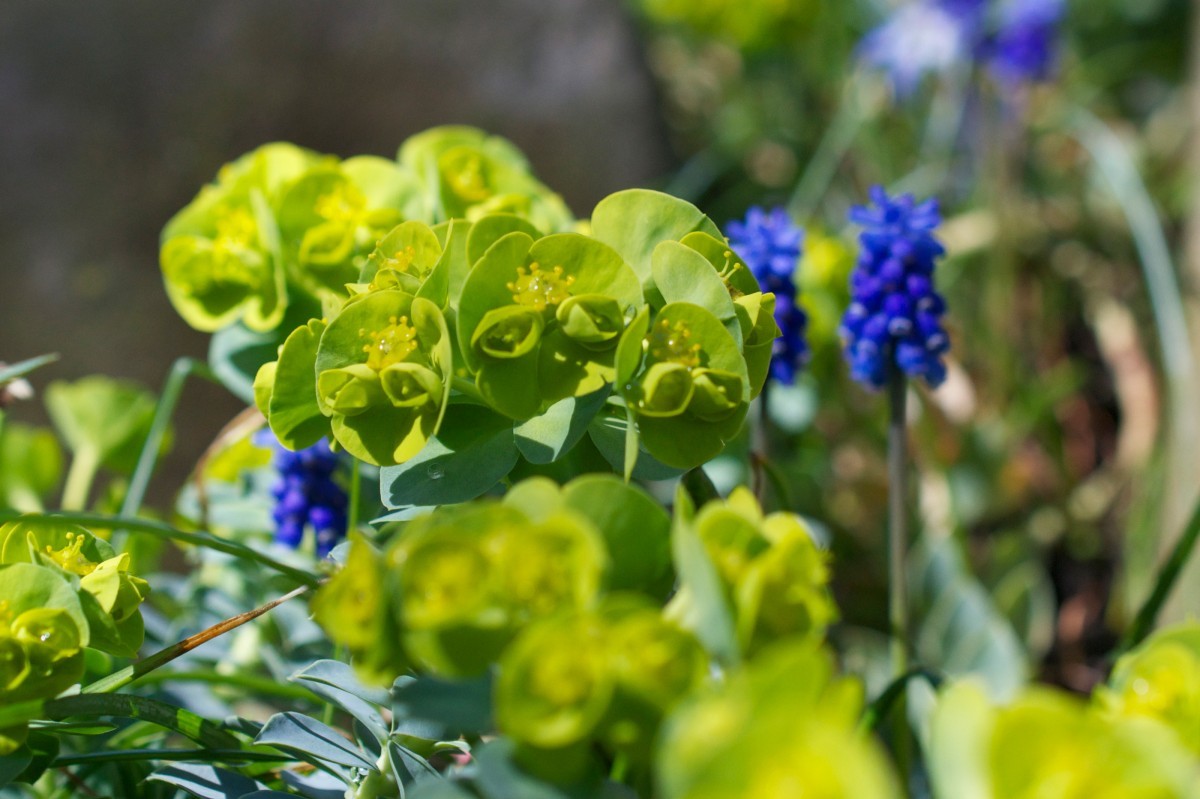
The image style should be lively, focusing on one subject at a time and incorporating a sense of perspective. All pictures must feature plants observed at the Brooklyn Botanical Garden.

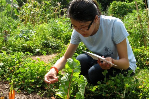
03
Images

Brooklyn Botanic Garden
03
Graphics
The graphic style mirrors the thickness of the body and the slimness of the legs, maintaining consistency in both perspective and front-facing views.

Branding goes beyond visuals like logos and colors, it's rooted in the "why" behind a brand's existence. This purpose shapes everything, from messaging and tone to customer experiences. Visual identity supports the "why," but the true essence of a brand lies in the emotional connection it creates and the trust it builds.
NEXT PROJECT
Connect
WHAT I LEARNED
