Overview
Redesign the website's user interface to enhance visual appeal, improve usability, and create a more seamless and engaging user experience across all devices.
The Problem
The user interface is overly complex, which makes it challenging for users to navigate and find what they need quickly. Additionally, there are responsiveness issues that affect how the site displays and functions across various devices.
The Solution
The website was redesigned to create a more intuitive and user-friendly experience. Navigation was simplified, key features were made more accessible, and the overall layout was streamlined to help users find information and complete actions with ease.
PROJECT
CVS
TEAM
Keishlyan Carrero Detres
ROLE
UI Designer
TOOLS
Figma


I learned that responsive design is crucial for ensuring a seamless user experience across various devices, making websites more accessible and functional. Additionally, I realized that a well-designed user interface (UI) can significantly improve how people interact with digital platforms, making tasks easier, faster, and more enjoyable.
WHAT I LEARNED
SOLUTIONS
Category
Page 1
cart
Page 3
A new progress bar has been added to help users easily track how close they are to qualifying for free shipping. Additionally, product cards have been redesigned for improved readability, with clearer layout and visual hierarchy to help users browse and compare items more efficiently.
We reorganized the hierarchy of how products are displayed to prioritize what matters most to users. Seasonal deals are now highlighted more prominently in the hero banner.
product detail
Page 2
The product page has been streamlined for a more concise and user-friendly experience. Users can now easily sort through reviews, upload their own photos, and get a better sense of real product use. We also made it simpler to switch between stores and choose between pickup or shipping options, giving users more flexibility and control.
responsive design
Light Mode & DARK MODE
C: 92% M: 68% Y: 12% K 1%
R: 34 G: 92 B: 154
Pantone P 105-7 C
#225C9A
C: 92% M: 68% Y: 12% K 1%
R: 34 G: 92 B: 154
Pantone P 105-7 C
#225C9A
Jester
60%
30%
The Creator
Aa
ABCDEFGHIJKLMNOPQRSTUVWXYZ
abcdefghijklmnopqrstuvwxyz
NUNITO SANS
BRAND ARCHETYPE
Design system
The color palette was intentionally chosen to represent both the food and beauty industries, capturing the essence of both worlds. The typeface was selected because it aligns with our brand archetype, reinforcing the tone, personality, and values we want to communicate.
Pick it up - free
Pick it up Tuesday, September 12th
Ship it
Monday, September 18th
How to get it
Advil Pain Reliever/ Fever Reducer 200 MG
Ibuprofen Tablets
Size: 24 CT | Wt. 0.08 CT
$14.49
Remove
1


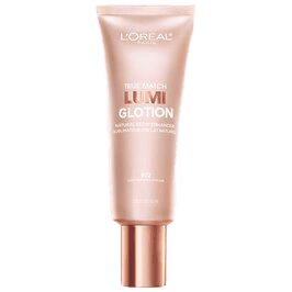
True Match
Lumi Glotion
$18.49
495
+

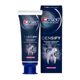
Crest Fluoride Toothpaste
$8.79
89
+


At-home COVID-
19 test kits
Convenient and simple solutions for testing for COVID-19.
Shop at-home COVID-19 tests

ExtraCare
Get 2% back and so much more
Sign up for ExtraCare
C: 92% M: 68% Y: 12% K 1%
R: 34 G: 92 B: 154
Pantone P 105-7 C
#225C9A
C: 92% M: 68% Y: 12% K 1%
R: 34 G: 92 B: 154
Pantone P 105-7 C
#225C9A
C: 92% M: 68% Y: 12% K 1%
R: 34 G: 92 B: 154
Pantone P 105-7 C
#225C9A
C: 92% M: 68% Y: 12% K 1%
R: 34 G: 92 B: 154
Pantone P 105-7 C
#225C9A
C: 92% M: 68% Y: 12% K 1%
R: 34 G: 92 B: 154
Pantone P 105-7 C
#225C9A
C: 92% M: 68% Y: 12% K 1%
R: 34 G: 92 B: 154
Pantone P 105-7 C
#225C9A
C: 92% M: 68% Y: 12% K 1%
R: 34 G: 92 B: 154
Pantone P 105-7 C
#225C9A
C: 92% M: 68% Y: 12% K 1%
R: 34 G: 92 B: 154
Pantone P 105-7 C
#225C9A
C: 92% M: 68% Y: 12% K 1%
R: 34 G: 92 B: 154
Pantone P 105-7 C
#225C9A
C: 92% M: 68% Y: 12% K 1%
R: 34 G: 92 B: 154
Pantone P 105-7 C
#225C9A
C: 92% M: 68% Y: 12% K 1%
R: 34 G: 92 B: 154
Pantone P 105-7 C
#225C9A
C: 92% M: 68% Y: 12% K 1%
R: 34 G: 92 B: 154
Pantone P 105-7 C
#225C9A
C: 92% M: 68% Y: 12% K 1%
R: 34 G: 92 B: 154
Pantone P 105-7 C
#225C9A
C: 92% M: 68% Y: 12% K 1%
R: 34 G: 92 B: 154
Pantone P 105-7 C
#225C9A


